Data Visualisation Design for Analysis and Reporting
With the growth of computing and data storage capabilities, firms have access to more operational and financial data and are faced with the emerging challenge of how to articulate commercial insights. Using the basic, static dashboards of the past will only show a surface level summary of the data and will not keep up with conveying findings effectively.
So how do you get commercial benefit from the data that is relevant to your business? Fortunately, with the rise in data complexity, there has also been a rise in the availability and quality of data visualisation tools that enable the creative and detailed presentation of data. Visualisation dashboards should encourage the user to explore deeper aspects of the data and provide an easy avenue for them to do so. We want to produce a solution that presents the user with innovative displays and allows them to extract valuable information at a detailed level. It makes storytelling easier and enhances your understanding of data insights.
This is a best practice guide for creating dashboards that present the user with innovative displays and allows them to extract valuable information at a detailed level. This guide also presents important frameworks that ensure the data is communicated in an efficient and insightful way.

Effective Data Storytelling
Data Storytelling and Context
Data visualisation helps uncover patterns in data, but we cannot assume that everyone can interpret the visualisations. Delivering an isolated report is risky as the information may be misinterpreted, potentially leading to costly decisions. It is therefore our goal to use data storytelling to unite data visualisations in its correct context.
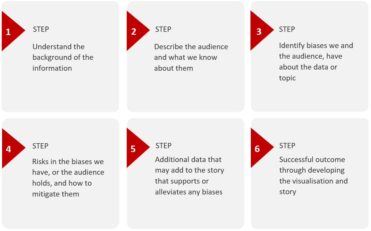
Achieving the proper context at the start of the storytelling process will increase the likelihood of creating an effective visualisation with a high level of absorption by the intended audience. The process of setting the context can be broken into six key steps:
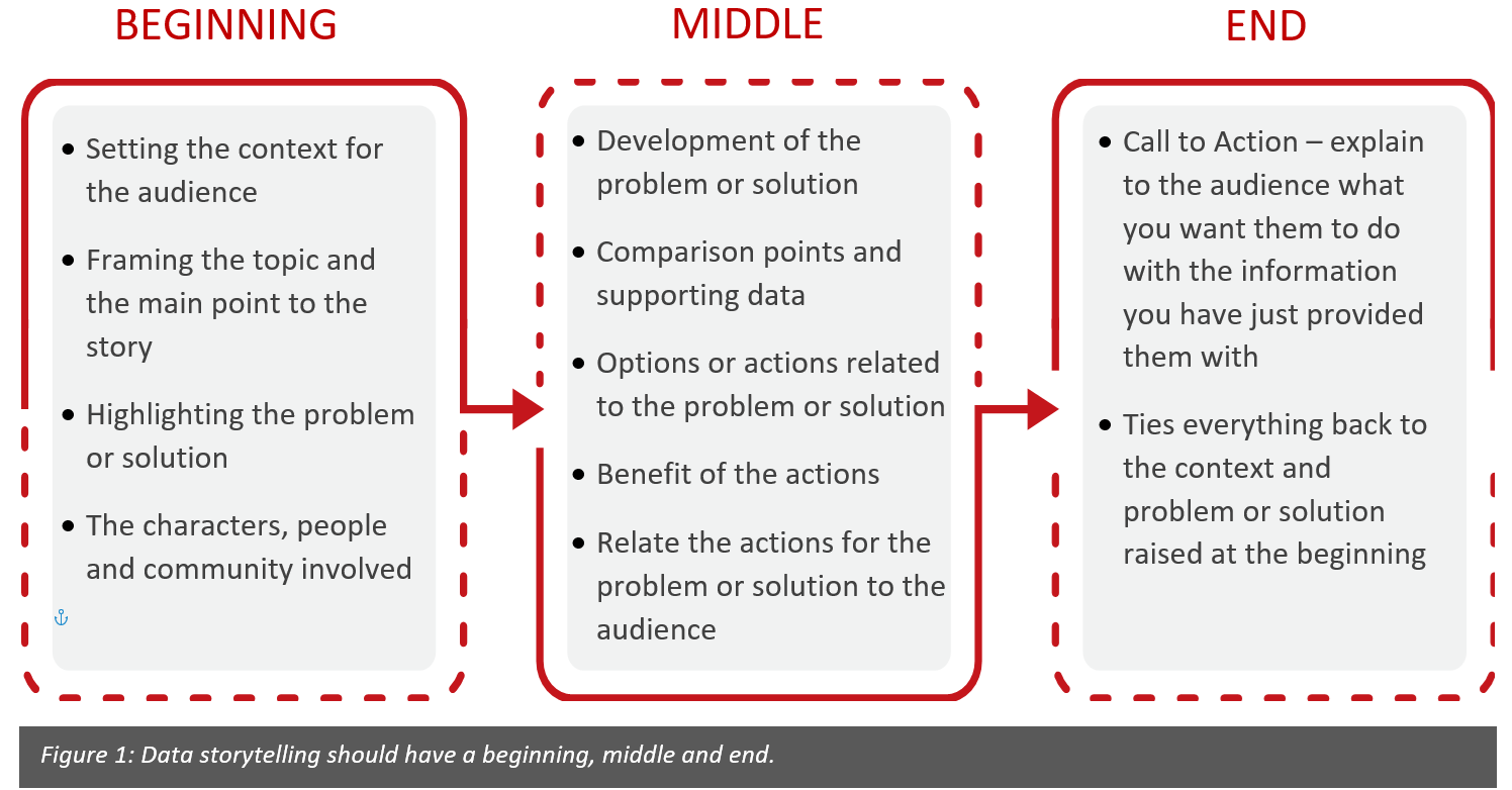
Once we have the context sorted, we can continue toward developing a data story. Like any good story, it should be constructed with a beginning, middle and end:
The next section explains the layout of data visualisation tools, such as Power BI or Tableau, and how the user can flow through the experience, starting with a beginning (the main dashboard monitor), drilling-down into a specific problem (analysis pages) and finding a call to action (confirmed with details).
M.A.D Framework and User Experience
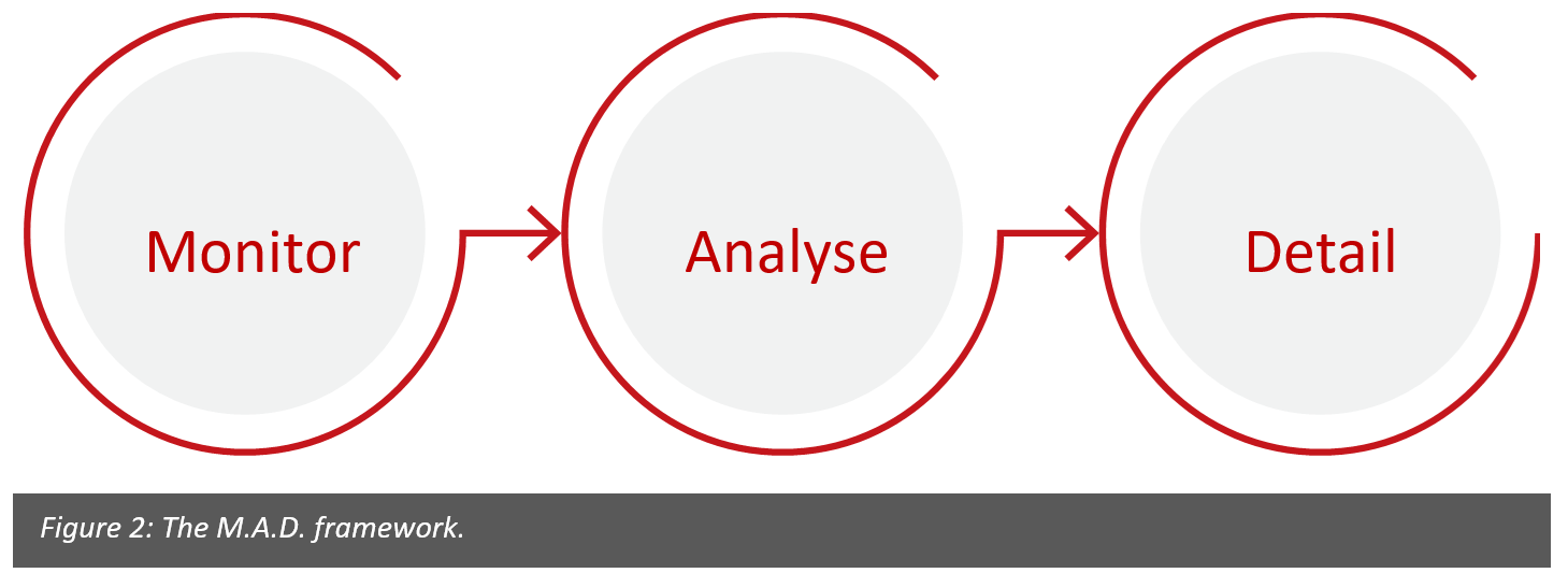
Once the context and data story have been constructed, we can start to think about how to coordinate the story across multiple pages in a report. The M.A.D. framework, “Monitor-Analyse-Detail”, works to synchronise data across report pages by allowing the end user to flow through data using a top-down approach to view data at 3 different levels of detail.
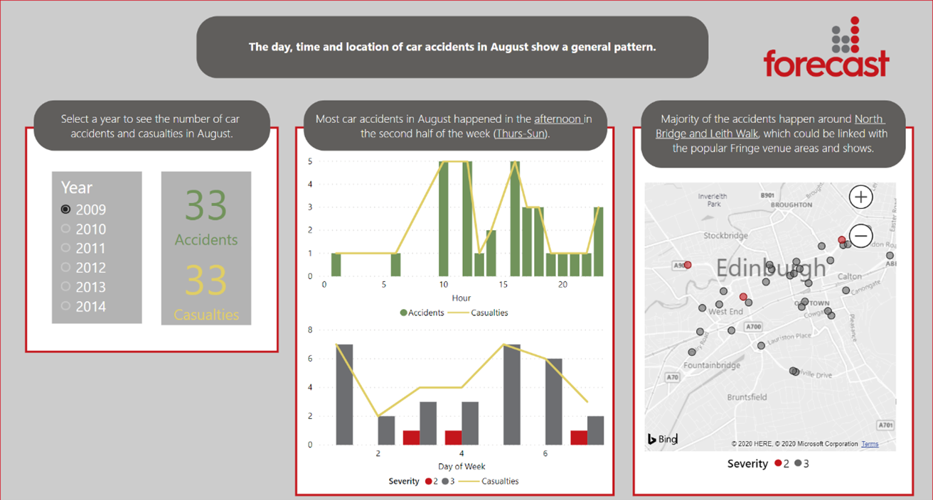
When not all your information is equally important, you want your reader to prioritise some visualisations over others. You can show a hierarchy of information by using a few key design best practices shown in Figure 3.
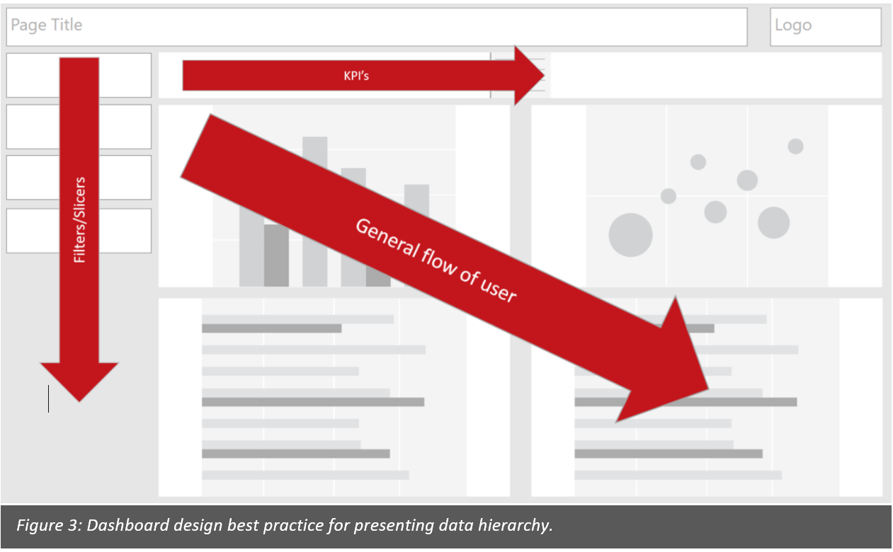
Monitor – this is the “dashboard” part of the report. A dashboard is a graphical user interface which provides at-a-glance views of relevant KPIs. It is meant to provide a quick snapshot of the required information for the end user to understand the status of a project or organisation at a high level.
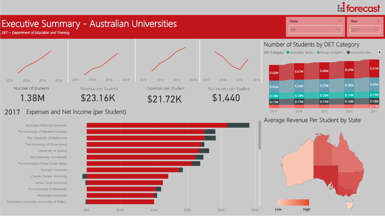
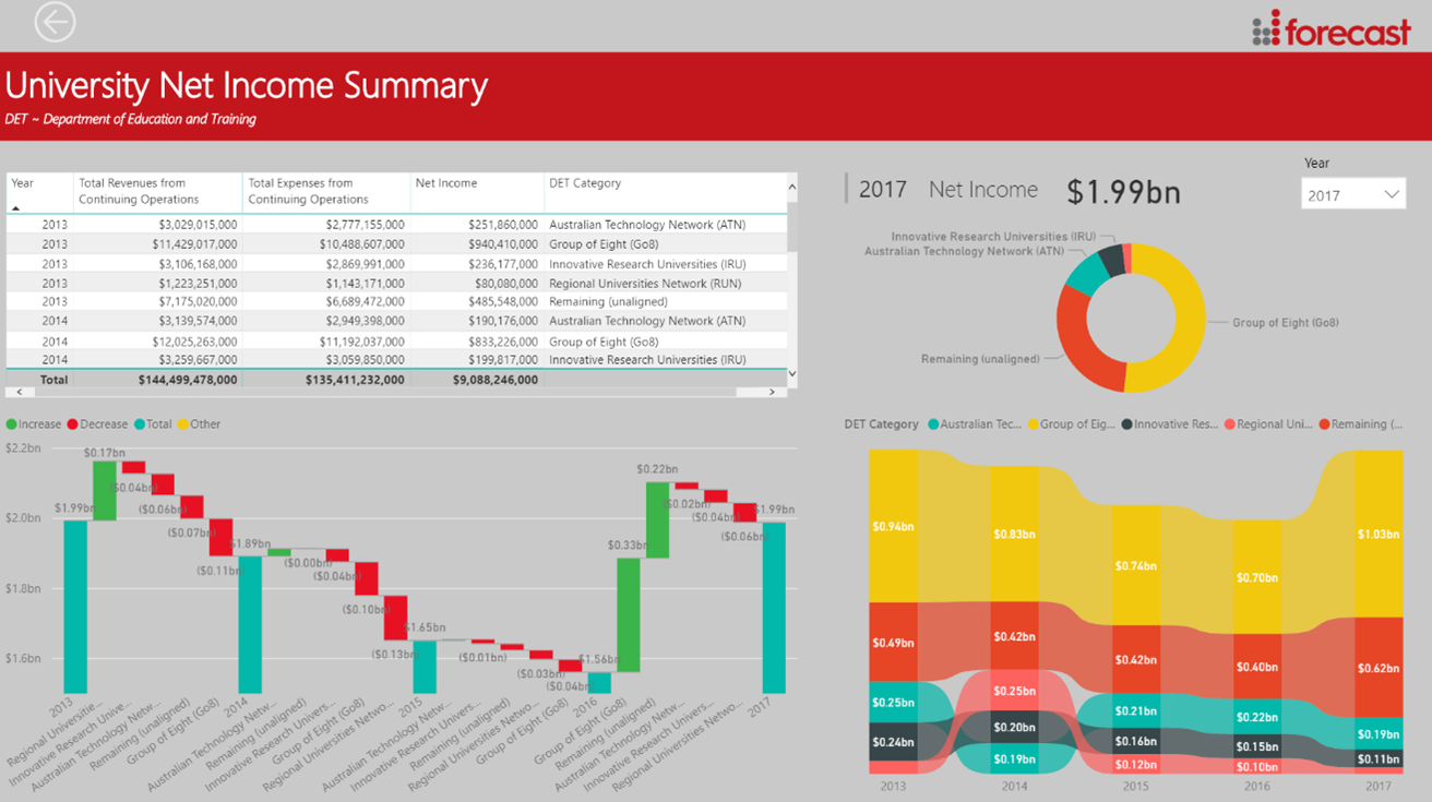
Analyse – this is the next level of the dashboard which allows the user to dig a little deeper to understand separate issues. In the dashboard shown in Figure 5, the “analyse” section would include a drill-down into separate universities or student categories to bring these components to greater focus.
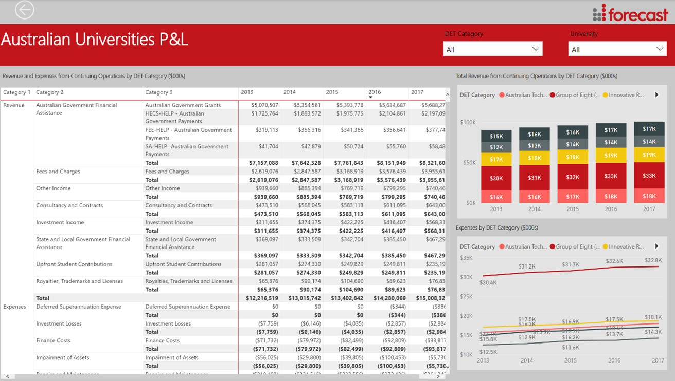
Detail – when the end user has identified a possible issue that needs further investigating, they may require further detailed pieces of data which may be presented through detail sheets. The detail sheets are typically large tables of transaction data filtered through the process of analysis.
More Interactions, Greater Detail
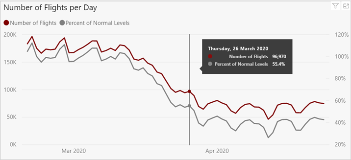
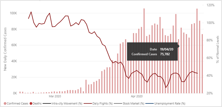
Building out a story using a data visualisation tool such as Power BI or Tableau allows the end user to pick up on the context of the data and problem with ease. Furthermore, the user can drill-down into greater detail when they suspect a problem has arisen. This is facilitated with the use of interactive, intuitive charts and buttons that allow the user to visually pinpoint problems with greater ease. Charts and graphs can be selected to drill-down into specific pages, or a tooltip can be created when hovering over specific areas to provide greater detail at a glance.
Examples of intuitive charts and designs are shown in Figure 7 and Figure 8:
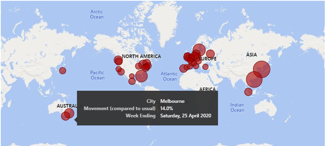
Geographic Data Representation
Geographical representation of data can be a powerful tool for visualising and navigation. The inclusion of maps within dashboards is visually appealing and allows users to quickly gain a locational understanding of data from multiple regions.
Bespoke Dashboards
It is important that the data visualisation approach matches the depth and complexity of the data. Traditional approaches to presenting data (PowerPoint, PDF, etc.) are often not sufficient and the user is unable to explore and extract valuable information using tools that lack interaction, extraction and large data storage capabilities. A dashboard-based data visualisation tool allows for the creative presentation of data while also providing the user the power to interact for themselves.
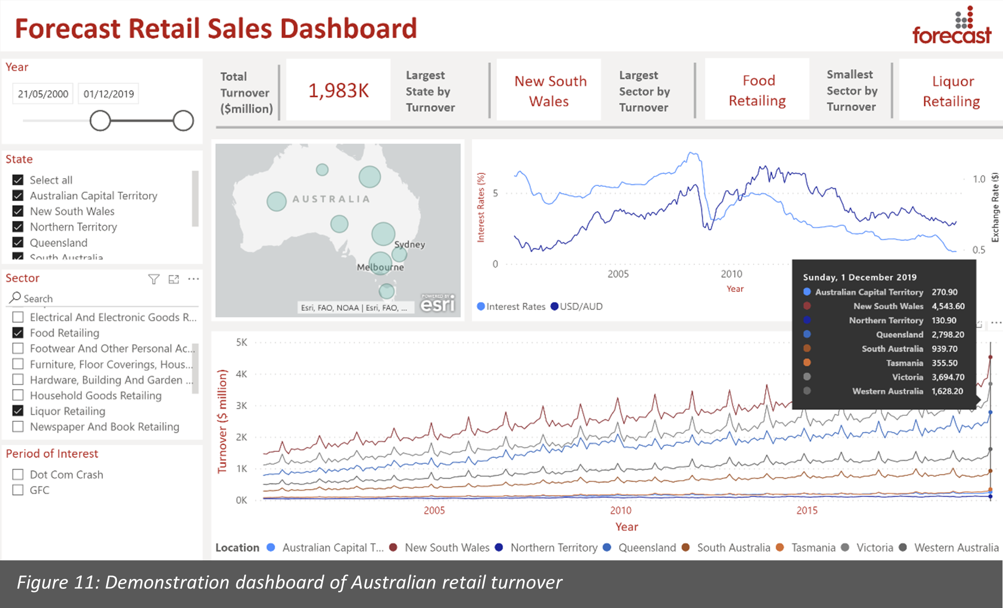
Australia Retail Dashboard
Figure 11 shows a demonstration of Australian retail data in an interactive dashboard using Microsoft Power BI. In this example, the dashboard shows a summary of retail turnover data from the Australian Bureau of Statistics. The data is segmented by state and retail sector, with time series data over a 40 year period. This clearly shows the seasonal nature of the retail industry, with a strong peak in December of each year. For this view of the dashboard, we have selected food and liquor retailing.
The dashboard also includes non-retail economic data (interest rates and exchanges rates). Each of these can be examined in detail using this dashboard. The drop-down boxes (slicers) on the left vertical pane allow the user to select individual years, states, and sectors to focus in on. The KPIs running horizontally above the charts are dynamic and adjust to these slicers to allow for a more detailed analysis to examine areas of interest in isolation.
Focusing on the Detail to Give You the Bigger Picture
Forecast Analytics in Practice
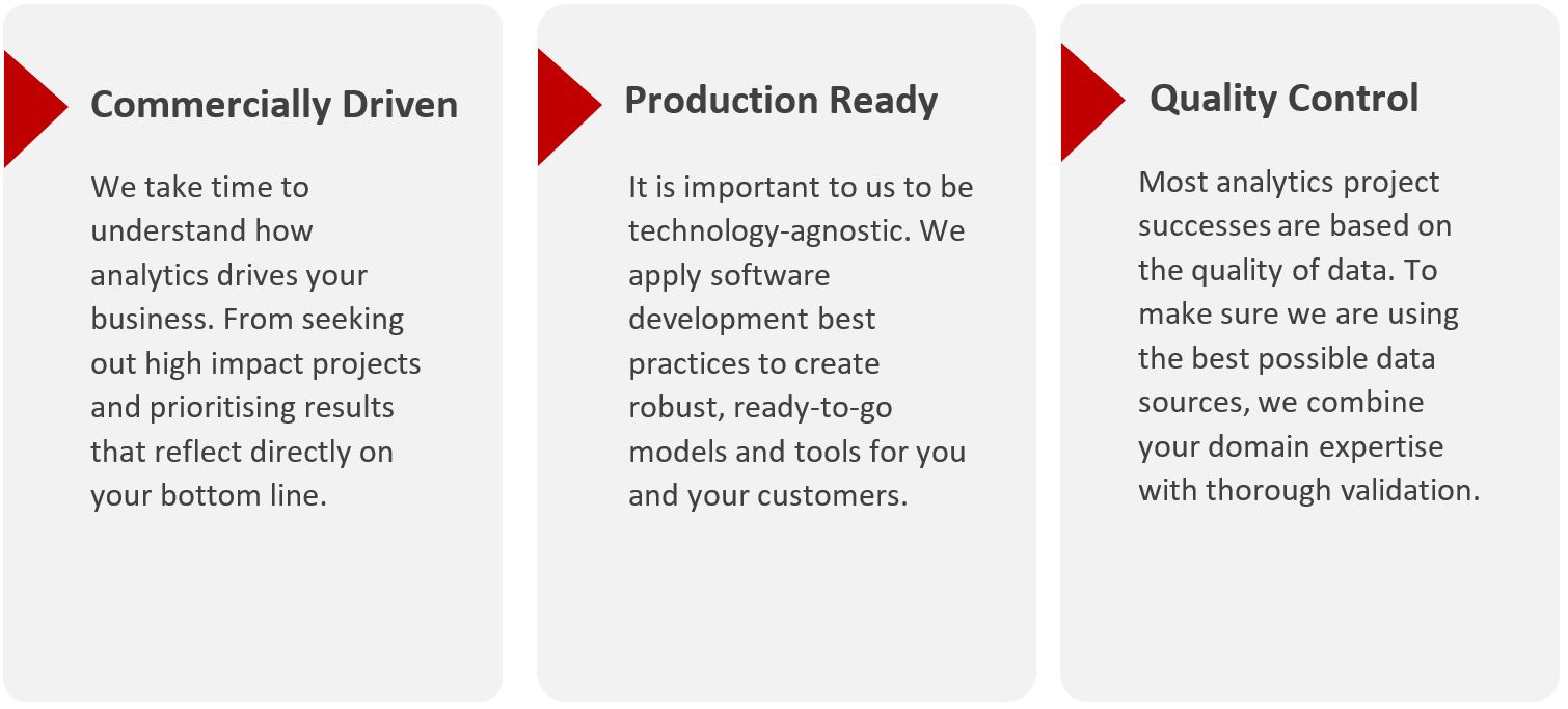
Our work focuses on advanced analytics and is rooted in technical expertise, client experience and delivery. What could that look like for you?